Prinsparets Stiftelse

Prinsparets Stiftelse

Making the web a safer place for young people

Visit website

Visit website

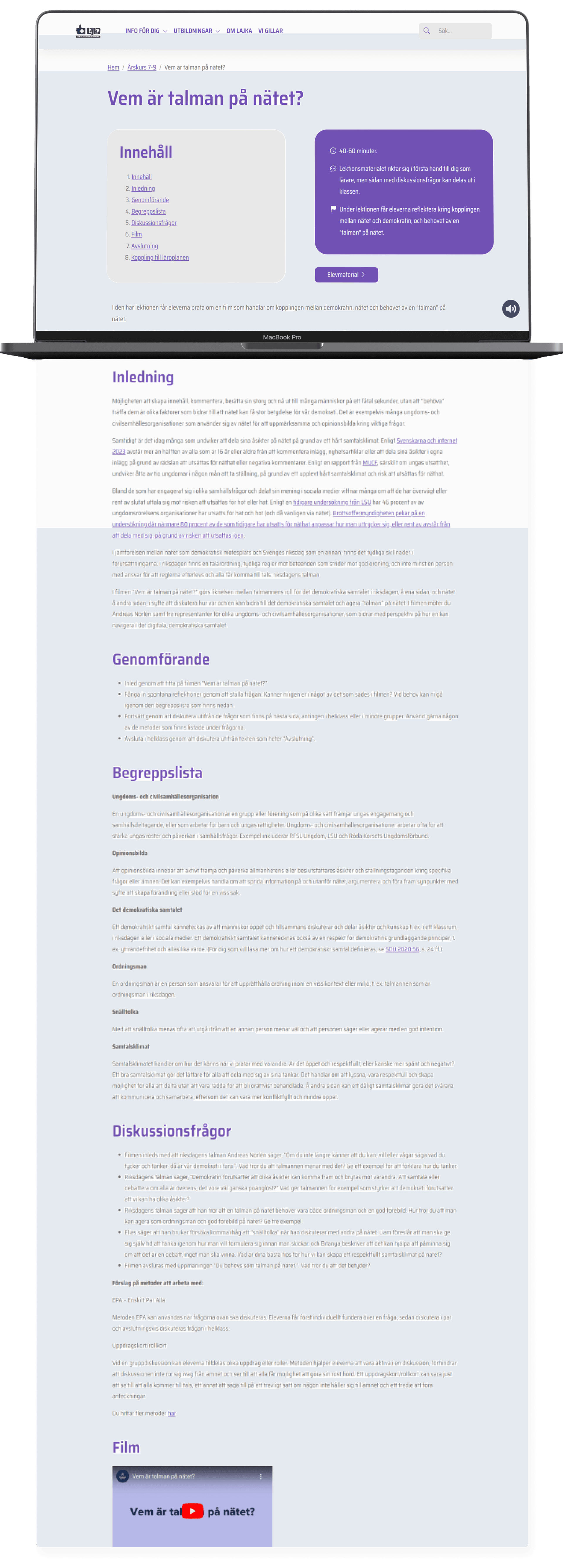
Lajka is an online haven created by Prinsparets Stiftelse, a learning platform on a mission to make the internet safer for the younger generation. It's like a virtual school, offering lectures from pre-school to high school, bringing together teachers, students, and parents.

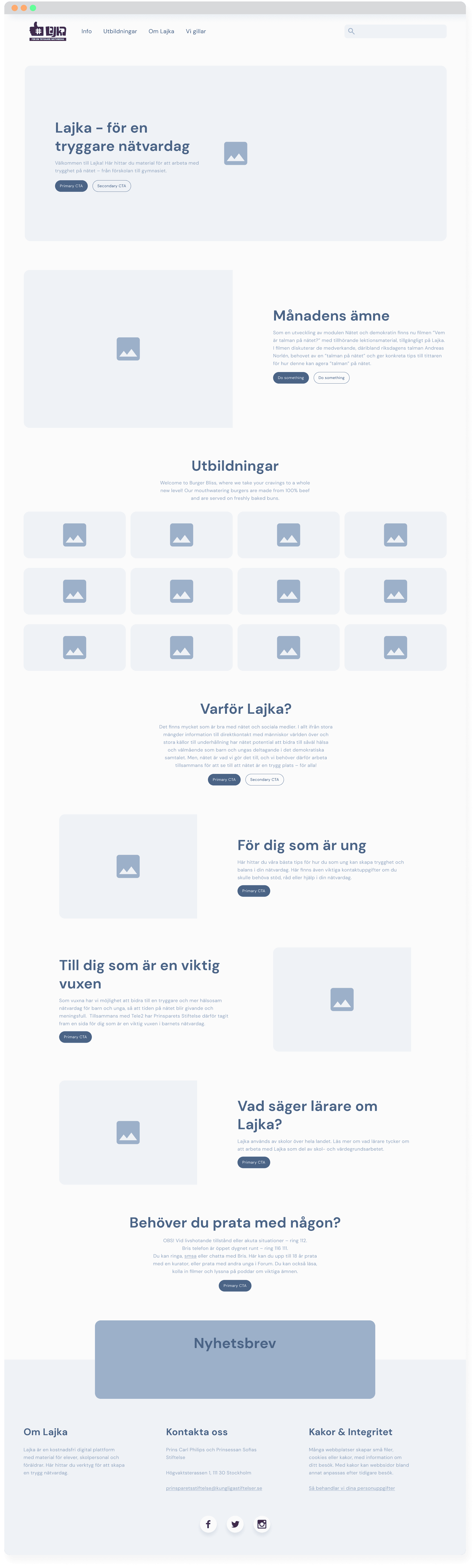
The cause? Absolutely commendable. The problem? The old website was unfortunately holding back a wealth of knowledge due to its downright unfriendly user experience.

As the Lead UX/UI Designer, my mission was clear: revamp Lajka into a visually appealing and user-friendly web platform. The goal? To unleash the power of these incredible lectures about online safety that were drowning in the chaos.

"Our teachers thinks Lajka is a good platform but it's too difficult to use"

"Our teachers thinks Lajka is a good platform but it's too difficult to use"

It wasn't about removing, changing or adding content. The content was there - and the lectures were good - but the problem was the users didn't get there in the first place. We needed to take the content that was already in place but put it into a new context. One that makes more sense.


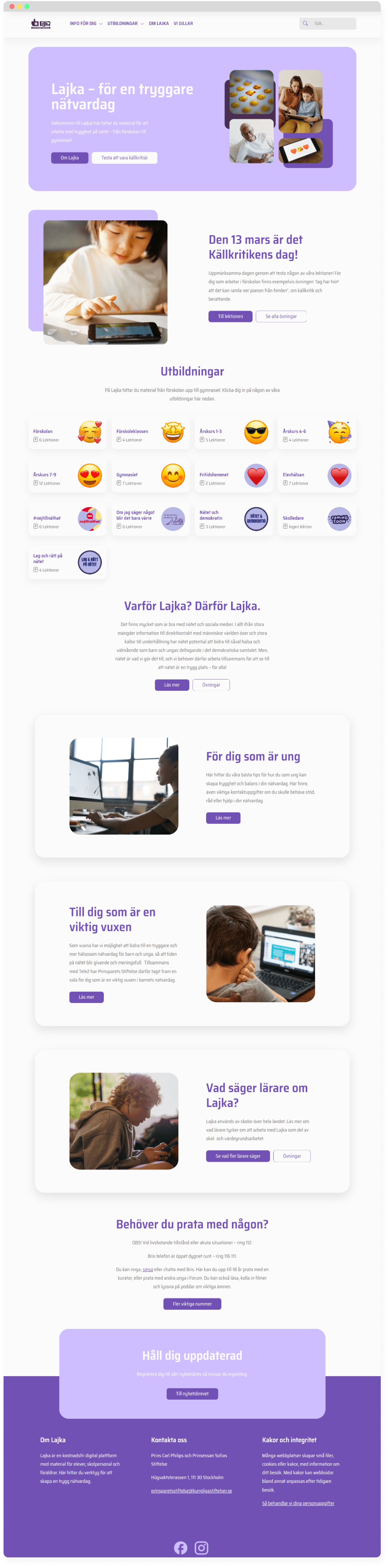
First things' first. We needed a complete overhaul of the home page layout. The old one neither look or behaved like a website to begin with. So I started by wireframing and running it by the client. By giving Lajka a more familiar look we give our users the confidence to continue browsing the site instead of being overwhelmed by lots of illogical, unreadable boxes that doesn't behave like they should. Jaokb's Law, right?

Secondly, the old interface was plagued by something I'd like to call a "font free-for-all". On the home page alone there were 4 different fonts so naturally I cut that down to one, giving Lajka a more coherent look while improving the readability.


A specific request from Prinsparets Stiftelse was to keep the purple and green accents, but use them more wisely. However we removed all of the unnecessary colors. It was like someone had just dipped a paintbrush in some random purple and green and started going crazy on a canvas.

Image of new Lajka home page

Maybe the most important aspect of this project was to understand our users. Now, Lajka can of course be used by anyone, but it's supposed to be mainly used by teachers. So it needed to be catered to them.

By workshopping together with the client we did sort of a mini user persona based on who they had talked to and the feedback they had gotten. They know their audience very well which was super helpful for me but by having this session it became very clear what the outlying problems were, and what we needed to achieve to overcome them.

An overall theme was that most of them thought the website was too difficult to use. On top of a confusing UI there were also a lot of unwanted interactions for example. Like "hover here" or "click there" to reveal content. So we decided that our main goal had to be to make a website that feels modern, clean but above all is easy to use.

Maybe the most important aspect of this project was to understand our users. Now, Lajka can of course be used by anyone, but it's supposed to be mainly used by teachers. So it needed to be catered to them.

By workshopping together the client and I did a user persona based on who they had talked to and the feedback they had gotten.

An overall theme was that most of them thought the website was too difficult. There was a lot of unwanted interactions etc. So we decided that our main goal was to make the website easy to use.

Image of new Lajka home page

Maybe the most important piece of the puzzle is of course the lesson page. It's somewhat the heart of the page and where our user will spend most of their time. The lesson pages are also the pages that contains the most dynamic content as there will be new lessons over time. So what we needed to accomplish here was to make it easy to use from a teachers perspective while also creating a process where anyone can update and create new content with ease.

To solve the first problem we thought, what's the absolute easiest thing to do on a website? Just scroll and read, right? No fancy hovering or complex interactions. Just kick back, scroll at your own pace, and find what you need.

A major upgrade from the old setup where you had to click to reveal different sections of the lesson. And clicking on a new section would shut down the previous one – kind of messy. Users found it a bit tricky, so we switched it up to straightforward, no-frills text. The only thing you have to click on is the table of contents – which is completely optional.

This change also made life easier on the second front – setting up the CMS. Whoever's adding new lessons doesn't need to be a web whiz. They just need to think about breaking down the lesson into sections, throw in some details like duration, and then fill it up with content. No worries about anything playing hide and seek behind tricky interactions. Keeping it smooth and user-friendly for teachers browsing the lessons and making content creation stress-free in the CMS.

Working with Lajka is probably the proudest achievement I have in my career, and the most fulfilling project to work on. It was also the first time I really took the lead and managed everything from project planning, client communication, leading workshops, doing design…


Working on this project I think also marks the moment when I truly realized that doing UX/UI is not about how cool stuff you can do in Figma, it's communication and understanding what's needed for this specific project and user.

And it couldn't have gone any better. The client, the users and even the prince and princess themselves absolutely loved the new changes. In fact they liked it so much that they wanted to use the Lajka interface as a template for other websites they're making. Check this out for example: https://nathatshjalpen.se/. So if you see similar sites with a change in color and fonts, you know where the original came from!


Being part of a project with a purpose is truly fulfilling. Creating something that contributes positively to society is a badge of honor. I really hope I can venture into more projects like this, where design meets impact, in the chapters yet to unfold.

Thank you for visiting my page!

I hope you enjoyed your stay. Not that you have to go, but if you do I hope you have a great day!

Here’s a random fact I like:

Tigers have striped skin, not just striped fur. Even if you were to shave a tiger, you would still see the distinctive stripe patterns on its skin. 🐯

Made by me with 🧡, a lot of ☕️ and Framer

Copyright © 2024 Isac Geisewall. All rights reserved.