
Molding a virtual chocolate paradise

Something the old website was clearly lacking to achieve "cozyness" was color. The previous design relied heavily on images for even any hint of color, so we needed to come up with a color palette that matched what they wanted their users to feel. Here's where we immediately ran into a problem – Wermlands Choklad did not have any brand identity guidelines.
While this allowed for creative freedom, it also posed a puzzle of "what's allowed and what's not?" In the absence of strict guidelines, I took the liberty to craft a palette that felt right. However, per the clients request, we kept two things – the font and the yellow hue. And to help us better understand what they wanted we asked the client to create a moodboard which they we totally on board with.

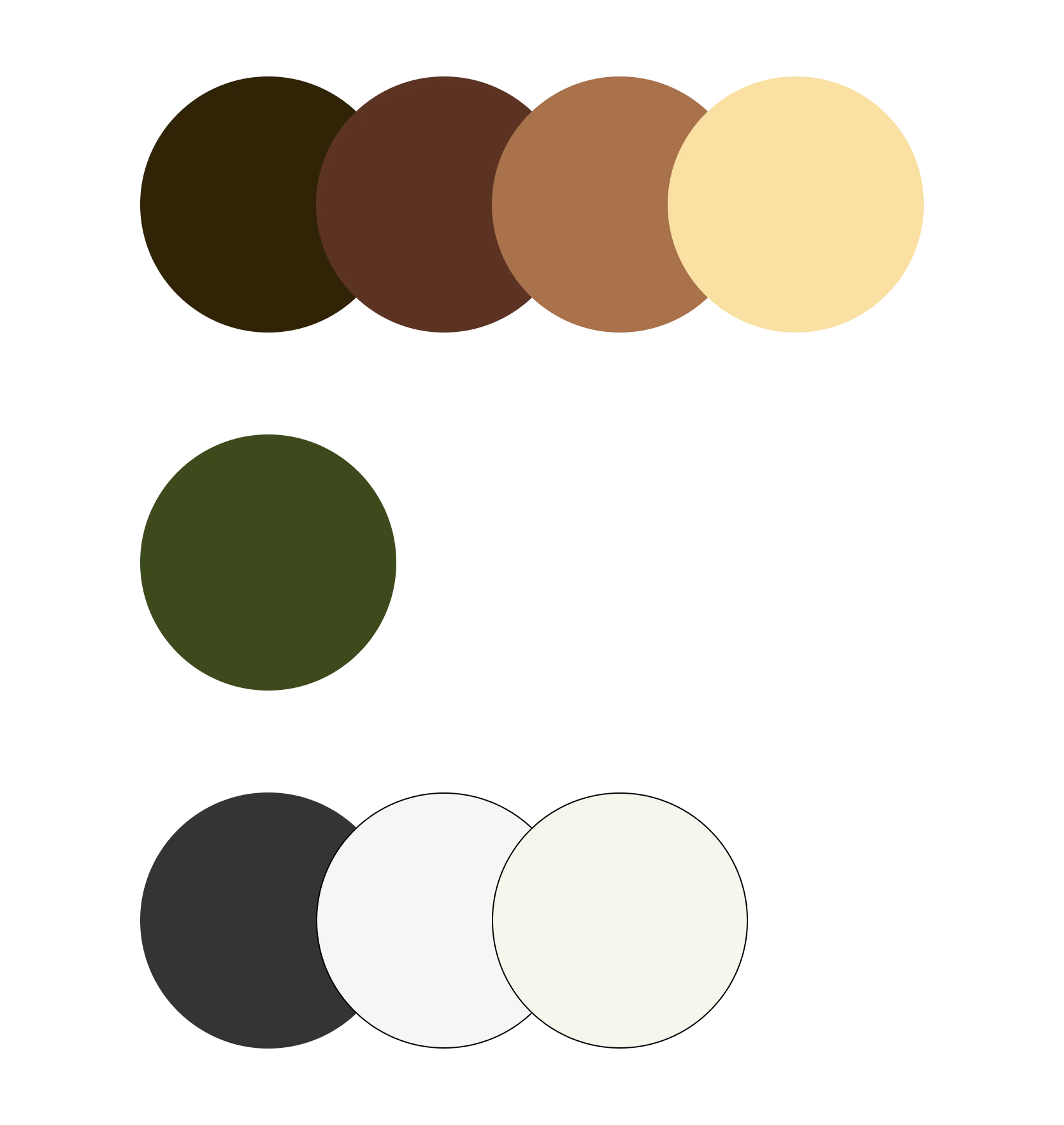
Primary Shades: Chocolate and Forests
The cornerstone of the palette revolves around different shades of brown, this is to represent both the diverse range of chocolates Wermlands Choklad offers and the trees of Värmland.
Secondary Hue: A Breath of Wilderness
Adding a touch of green injects a natural, wildlife-infused ambiance. Complements the browns but also introduces a vibrant and organic element, to evoke the beauty of the wilderness.
Neutral Elegance: A Softer Monochrome
We shifted from shades of total black (000) and white (fff) and introduced a more natural palette.
What are some further elements we added to amplify that "you're in the forest" feeling? First of we decided to play around with some wavy shapes or whatever you want to call it. These represents both melted chocolate and the mountain silhouettes of the Värmland forests.
To further enhance the forest feeling we also added pine tree silhouettes, a little subtle in the background. Honestly, I just thought it looked nice and I presented it to client that couldn't agree more so - cool!
Another thing we did to make it feel more "genuine" and "home made" was to add… things. Like handcrafted wooden tools with like cocoa powder, cocoa beans etc.

I mentioned there were also some UX problems we needed to fix. So, what was that? Wermlands Choklad is a B2B chocolate manufacturer, they supply their products to a wide range of resellers, spanning from candy stores to spas to hotels and much more. Whether you're a business wanting to stock their chocolates or an individual curious about where to purchase them, navigating the website should provide a clear pathway to access this information, right? Unfortunately, that wasn't the case.
One significant issue plaguing the site was the absence of a clear process for users interested in purchasing their products, or becoming resellers. As I immersed myself in the role of a potential buyer—let's say, a spa eager to enhance its chocolate offerings—I encountered Wermlands Choklad and wanted more information about their chocolate bars and potential availability for purchase. When I went to the "all products" page and pressed on a specific product… nothing happened. I got really confused first but then realized there are no pages for the individual products.

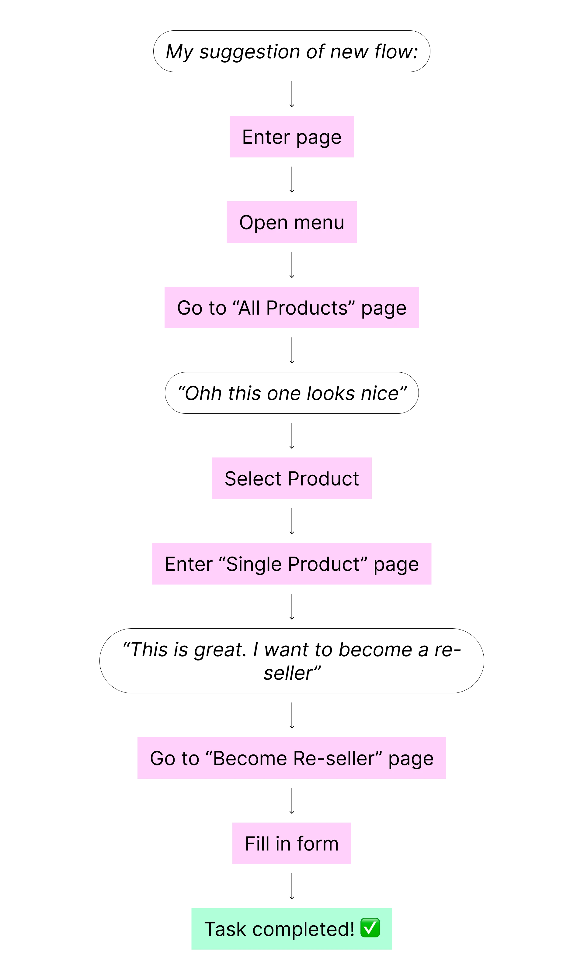

Navigating through the website could easily lead to frustration or even abandonment. For those that didn't know you can become a reseller, they might remain unaware. To inquire about becoming a reseller, users had to backtrack to the menu and then guess their next steps. Eventually reaching the contact page, they'd find a small paragraph mentioning, "If you want to become a reseller, contact us."
Clearly, this needed improvement. Notably, you might have noticed there was no "Selected Product" page— you know, a dedicated space to explore a single chocolate product in detail, understanding why Wermlands Choklad's offerings are unrivaled in the market. This addition enhanced the user experience by providing comprehensive product information in one place.
Moreover, we introduced two prominent call-to-action buttons on this page. One directs users to a form to initiate contact with Wermlands Choklad for reseller inquiries, while the other leads to a page showcasing where the chocolates are available for purchase.

I absolutely LOVED working on this project and with the people at Wermlands Choklad. The creative freedom - and trust - they gave me was really something special. It's probably my most creative project yet and it's all thanks to them allowing me to!
It really taught me that when you find a good synergy between everyone involved, together you can create something beautiful. I'm so proud of this and I hope I'll be working on similar projects in the future.